Lesson 19: The Wyckoff Wave Crypto Index and the Optimism-Pessimism Index

Todd Butterfield January 4, 2022
The main subject of Lesson 19 is the Wyckoff Wave Crypto Index and the Optimism-Pessimism Index. The purpose of this lesson is to discuss with you the origin, construction and the use of the Wyckoff Wave Crypto Index. To introduce the Optimism-Pessimism Index to you, and to discuss the coordination of the Wyckoff Wave Crypto Index and the Optimism-Pessimism Index.
This lesson is to better prepare you for understanding when Mr. Butterfield discusses these subjects on Youtube, or if you decide to subscribe to our Crypto “Pulse of the Market” charting software.
The principles regarding the analysis of a vertical chart, and a figure chart discussed on prior lessons, also apply to the analysis of the vertical chart and a figure chart of the Wyckoff Wave Crypto Index. As these have already been discussed rather extensively they will not be discussed here in detail. Our main concern will be with the intraday waves, the coordination of the intraday waves with the daily vertical chart of the Wave, and how you may coordinate the charts which are used in the analysis of the Wyckoff Wave Crypto Index and the Optimism-Pessimism Index.
In beginning any analysis, we first determine the trend of the market. We use the Wyckoff Wave Crypto Index for this purpose. We then compare the individual coins with the Wyckoff Wave Crypto Index. We can do this by first looking at the strongest/weakest groups versus the Wyckoff Wave Crypto Index . Then determine which coins from those groups are weaker or stronger than the Wave, and then analyze those individual coins which are likely to lead the Wave in its next movement. We begin our analysis with the Wyckoff Wave Crypto Index to determine the trend of the Wave. The Wyckoff Wave Crypto Index is designed to show the least line of resistance, or the trend of coins generally.
Mr. Wyckoff points out that the markets move to higher or lower levels by a series of surges, much like an incoming or out-going tide with successive waves higher or lower than the proceeding waves. All coin market movements whether they are large or small are made up of buying and selling waves. These waves build upward and build downward but all large market movements begin with the very smallest waves.
The Wyckoff Wave Crypto Index is designed to show these small wave like movements and to measure their strength. We can then combine a number of these small waves to obtain a larger perspective and to construct vertical and figure charts from the wave data. Let’s think about a wave in the ocean for a moment. Say a 20-foot wave which breaks and rolls up on the beach. There is some spray just ahead of the leading edge of the wave, and then there’s the leading edge itself, and then the bulk of the wave which could be divided into the forward part, the middle and the back part of the wave.
The water which is pushed the furthest up on the beach, is the water which is in the spray. The leading edge and the most forward part of the wave. Now very similarly on any sizable drive up in the coin market, there are a few very early leaders, or coins which move contrary to the market on the preceding reaction. These can be likened to the spray ahead of the ocean wave. Then a day or so before the upward drive begins, some early market leaders begin their up moves.
These may be likened to the leading edge. Then as the market turns and begins to move upward, there are usually a large number of coins that begin to turn about the same time, and these move upwards strongly until finally they crash and begin a new reaction. These coins may be likened to the forward part of the wave. They are followed by coins which turn upward later. These coins are likened to the back part of the wave. That part or portion of the wave farthest from the beach. These laggards usually have relative weak moves and usually stop moving up before the strong coins finish their trends. In other words, there is a tendency for the strongest coins to turn up relatively early, to be stronger, and to move further up than those coins which were late in completing the reactions and in beginning the move up. The same process occurs on the down moves.
Now in order for a coin or market to move upward, so much coins must be bought, this is volume. It will move a certain distance, this is price or price change. And the movement will last for a certain amount of time, this is time. The same process takes place on a downward move, in other words we can and do measure the duration, the amount of price change, and the volume of each wave and when each wave began and ended. For both the up waves and the down waves.
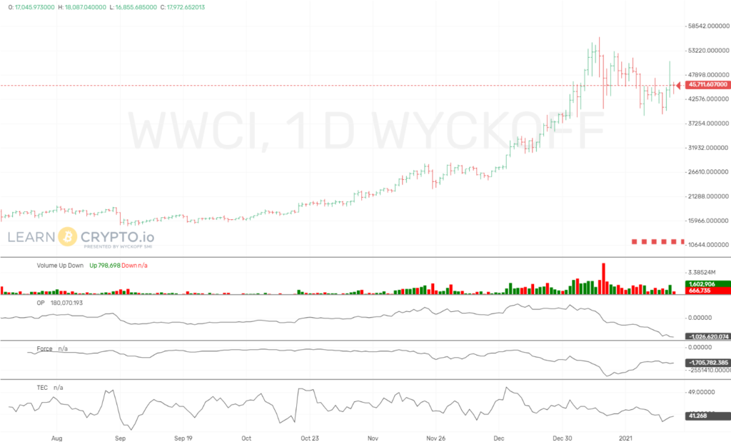
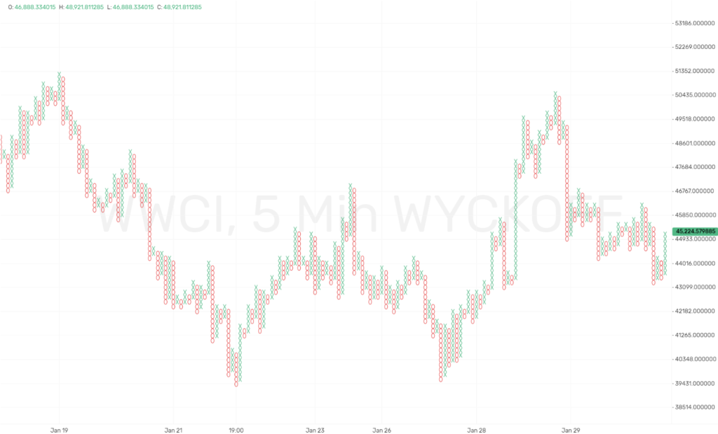
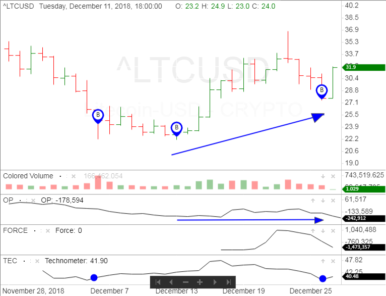
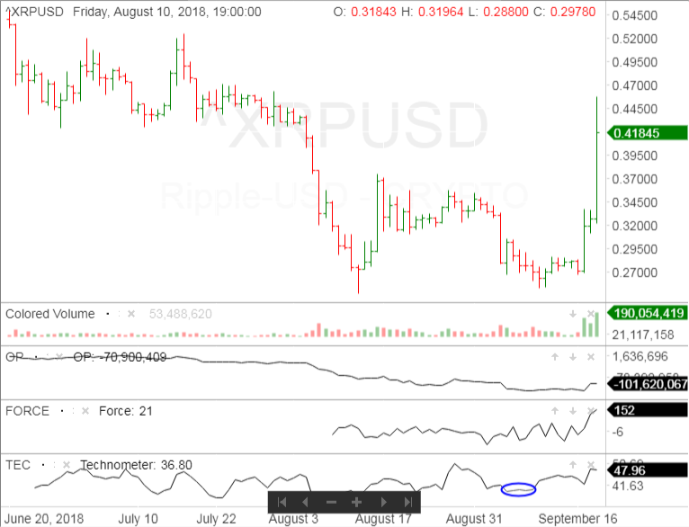
The chart of the Wyckoff Wave Crypto Index (WWCI) is the default 3-month chart that loads when you open our Pulse of the Market Crypto Charting Software. It has the price at the top, then colored volume, then the Optimism-Pessimism Index, then the Force and finally the Technometer. You can see the layout on chart 19.1.
Now before discussing what the Wyckoff Wave Crypto Index is, it is important to know what it is not. The Wyckoff Wave Crypto Index is not designed to be a market average, nor is it designed to enable you to calculate the percentage distance that all or a bulk of the coins in the market have moved in any trend movement. An average would be to slow moving, relatively insensitive and would not give you time to establish your position as the market is turning. By the time a reversal would be reflected in an average, the strongest coins and the best opportunities would have already have turned and be well away from the best buying or selling point.
Also the Wyckoff Wave Crypto Index is not composed of coins which may be dormant for many years and suddenly are whirled upwards, or smashed downward for two or three months and then again become dormant for many more years. It is not composed of coins which move contrary to the general market for long periods of time or for sizable distances. Nor is it composed of habitual laggards. An index with these types of coins could be very misleading.
Now what is the Wyckoff Wave Crypto Index, and what is it designed to do? The Wyckoff Wave Crypto Index is an index designed to measure the wave like movements of the market, and to reflect market leadership. There are four parts to this statement. The name of the index, that it is an index, that it measures the waves, and that it reflects market leadership. All are important.
The Wyckoff Wave Crypto Index is named after its inventor Mr. Richard D. Wyckoff. It is designed to be used as a tape reading tool, so that you can better pin point the turning points, and the relative strength of the successive waves in the market. It is an index, and a coin market index is comprised of a number of coins designed to represent something. Usually a larger group of coins or a type of market movement. An index serves as an indicator, pointer or guide. The Wyckoff Wave Crypto Index is designed to reflect market leadership. That is, the more permanent leadership of the market. Why? Well generally these leaders change direction before the bulk of the coins in the market reverse themselves. Therefore, they have forecasting or barometric value. Many of these coins are used to influence many of the other coins in its industry group, or the entire market, as the market travels from one level to another. The coins selected for the Wyckoff Wave come from this type of active leading coins. Examples of these coins are, Bitcoin, Dash, Ether, Ether Classic, Litecoin, and Ripple.
For many years we have used the Wyckoff Wave for a dual purpose in the stock market. A tape reading tool to measure the intraday waves, and as a market index designed to enable one to analyze the longer term trends, the immediate and major moves. We will do the same with the Wyckoff Wave Crypto Index for the Cryptocurrency markets.
This development and dual purpose rose out of the needs of Mr. Wyckoff and the students, and out of our developing knowledge. Very briefly that development occurred in this manner. Mr. Wyckoff invented the Wyckoff Wave as a tape reading tool to aid him in diagnosis’s the turning points and small fluctuations which occur during the day. He originally used five stocks in computing the Wave.
He used the New York Times Average which is really an index used to determine the longer term trend in the market. That is the minor, intermediate and major moves. However, he used the Wyckoff Wave for diagnosing the shifting of strength between supply and demand at the turning points. It was found that the New York Times Average and the other non-Wyckoff averages and indexes, were not sufficiently sensitive to enable the student to take his position before the move was well under way.
So a vertical line chart of the Wyckoff Wave was constructed and eventually introduced in our work in place of the New York Times Average. It was an excellent step forward. We know use a daily vertical chart of the Wyckoff Wave to portray this longer term picture. And again it was somewhat after that, that we began to use figure charts of the Wyckoff Wave.
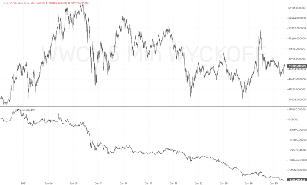
At present we are using the following types of charts for these purposes. One, a daily vertical chart of the Wyckoff Wave Crypto Index (WWCI) to determine the timing and direction of the minor, intermediate and major moves. This is previous mentioned above chart 19.1. Two, the intraday wave chart to analyze the intraday waves. This is shown below in chart 19.2.
Three, figure charts of the Wyckoff Wave to determine the counts and objectives of the Wave, which is found on chart 19.3.
We use various sizes of point and figure charts for the minor, intermediate, and major moves, without making a clear and ridged distinction for them. You must adjust the type of chart you are using according to the type and size of move that you are examining.
The use of the daily vertical chart, and point and figure charts, have been covered on prior lectures and will not be discussed in detail here. As the Wyckoff Wave Crypto Index is made up of market leaders you will often find that it will turn a day or two prior to the general market or a day or two before such a turn becomes apparent in the other market indexes and averages.
Due to its construction it has an extreme sensitivity at turning points. It provides a break down measure of the wave, it works out its counts and there is price continuity. Which is very important. For the index to function efficiently to diagnose the longer term moves, price continuity is maintained, and the coins making up the index are changed relatively infrequently when market leadership is lost. Each time a coin substitution is made in the index, it changes the character of the index slightly.
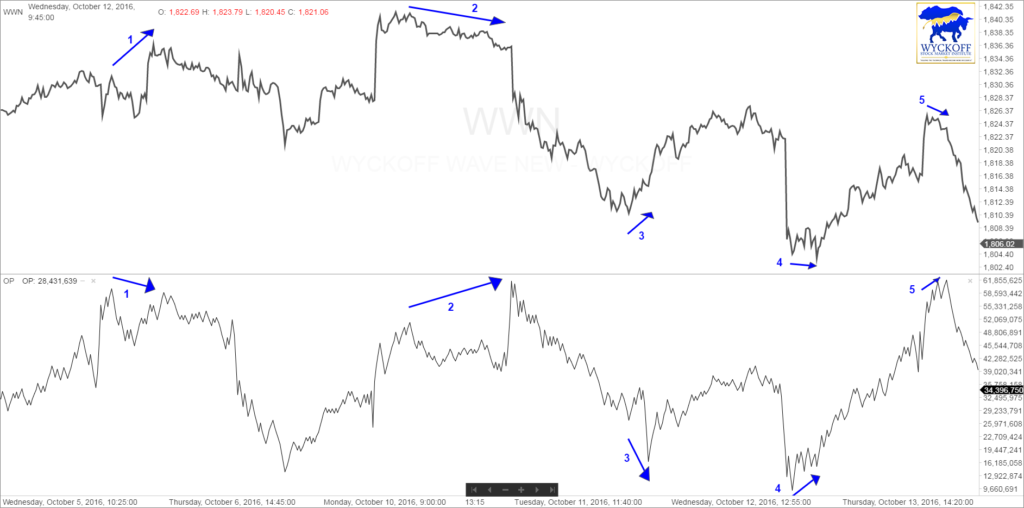
Chart 19.1 is the daily vertical line chart of the Wyckoff Wave Crypto Index, and chart 19.2 is the 5-minute intraday line chart of the Wyckoff Wave Crypto Index with the Optimism-Pessimism line chart at the bottom of the chart. You can also add volume as well to the bottom of the chart as depicted on the bottom of chart 19.4. The colored volume is close to the same information in most cases as the Optimism-Pessimism, just displayed in a different format. Some students like to have it displayed both ways.
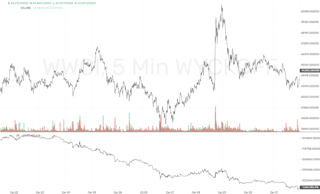
By observing the 5-minute Wyckoff Wave/Optimism-Pessimism intraday line chart, you can observe the buying and selling waves presented by the ebb and flow of supply and demand. You can easily observe the volume that is on the various intraday waves on the 5-minute line chart at the bottom of chart 19.2.
It is not necessary for you to know the detailed process of all this. It is sufficient for you to know the general process, the purpose of the wave, its advantages and how to use it. Your job is to use it to make money.
We also want to make you aware that we also have available a few other Wyckoff Wave Group Sector Indexes that we have constructed such as Wyckoff Wave Currrencies, Wyckoff Wave Developer Tools, Wyckoff Wave Fintech, Wyckoff Wave Value Exchange, Wyckoff Wave Authenticity, and Wyckoff Wave Shared Data. These have been constructed using the same format as the Wyckoff Wave Crypto Index. We monitor the 5-minute price and volume waves for all components of a sector index, and use this data to construct the Optimism-Pessimism, Force and Technometer for all sectors. This gives us a true picture of what is occurring in these sectors.
Now back to the Wave chart. In comparing the strength and weakness of the waves and the intraday waves, compare one wave with the succeeding wave, and also compare waves in the same direction. For example, compare an up wave with the next wave which will be a down wave, and compare that up wave with a prior up wave. You will find it helpful to compare the waves which occur at the same general price level. Such as a climax wave and a secondary test wave.
Not all waves are important and certainly not of equal importance. Probably the two most important factors used in the wave comparison is the change in the volume. The change pertains to the price change on each wave of the Wyckoff Wave. The volume figure is that of the stocks that compromise the Wave. As you work with the Wyckoff Wave, your judgment of the relative importance and the relative strength of the waves will sharpen.
Now for some interpretation. It is important to recognize that all Cryptocurrency market movements are governed by the longer term trend. That the shorter moves, the intermediate and minor moves against the major trend are only temporary, and they fit into the context of the major trend. The same thing applies to intraday waves. Therefore, the starting point for analyzing the Wyckoff Wave is to always analyze the long term picture to determine if the major trend is up, or down, or if it is in a trading range.
Let’s go on to the Optimism-Pessimism Index, sometimes called the O-P Index.
The Optimism-Pessimism Index is a study of volume, it is not a moving average, it is pure unadulterated volume, and our calculation for the volume comes directly from the Wyckoff Wave. Here is how it is calculated. We take the preceding days closing O-P figure as the base figure then we add the volume for the first wave to that figure and arrive at the new figure.
Then we add or subtract the second volume figure to that, and so forth until we come to the end of the day, and that becomes the new O-P Index figure for that day. In other words, we calculate the O-P Index figure for each wave and we also arrive at a total figure for the end of the day.
Let’s go over a few calculations of the O-P so you will be sure to understand. Chart 19.5 shows the intraday Wave and O-P chart.
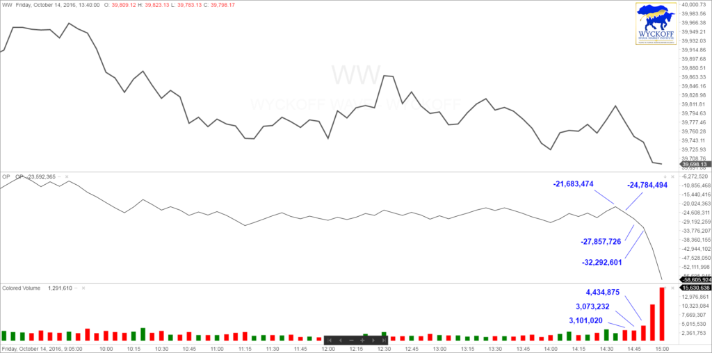
We are going to discuss the last few waves of the day which are all minus. The first data point for the O-P marked on the chart is -21,683,474. Then you can see at the bottom on the colored volume chart, that the next wave down had volume of 3,101,020. Since it is negative volume this number is subtracted from -21,683,474 gives you the next O-P value of -24,784,494. Then the next wave down had negative volume of 3,073,232 which subtracted from -24,784,494 gives you the next O-P value of -27,857,726. This continues for every wave of every day.
We are giving you the formula for the O-P Index. So that you may understand and accept readily the logic behind it. And how we use it with the price action of the Wyckoff Wave. As the O-P is a study of volume; it has the characteristic of being very persistent when it begins a trend. A trend on the O-P index persists and persists and persists and once the O-P has formed a series of support and supply lines, there is a strong tendency to stay within them. You may use both the normal and the reverse use of trend lines. The reverse use will show opposing action. You may use trend lines, halfway points and the thrusts. Do not fail to extend trend lines into the future for further reference and possible further indications. We say that when the O-P is moving up, that it is expressing optimism. Because there is an excess of plus volume over the minus volume and when the O-P Index is going down, we say that pessimism is coming into the market.
The Wyckoff Wave and the O-P Index may be used together and the comparisons may be made between the action of these two indexes, to give some very important information. Any trend in the price which is not sustained by volume is in a vulnerable condition. In other words, as the price moves up the volume should come in to sustain it. And as the price declines the volume should come in on the down side to sustain the downward push of prices. If the volume does not come in to sustain the price move the market is vulnerable to a move in the opposite direction.
Now with this basic market truth as a background we may conclude several things;
- That if the Wyckoff Wave and the O-P Index are going in opposite directions; and if it begun trends in the opposite direction, this condition cannot long continue. We call this divergence because they are going in diverse or divergent directions.
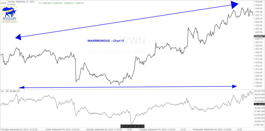
- If the Wyckoff Wave and the O-P Index are going in the same direction, and the trend of both is up, but if they are moving at different speeds, again, this condition cannot long continue. We call this inharmonious action.
- The principals of inharmonious action and divergence are a timing and a warning indication. Their appearance very often means a reversal of trend and when they occur, you should analyze the Wyckoff Wave very carefully.
Indications of the continuation of the trend of the O-P Index and the Wyckoff Wave are very important. Perhaps more important than reversals of trend.
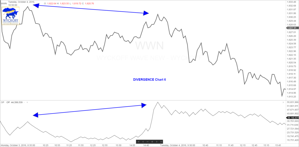
Let us exam the phenomenon of the divergence. A possible change in price trend from up to down is indicated by the O-P Index expressing optimism by moving upward with the Wyckoff Wave failing to respond and record a new high for that individual move as in chart #6.
This can also be shown on our Crypto software in the following chart of Litecoin (LTCUSD) #6B.
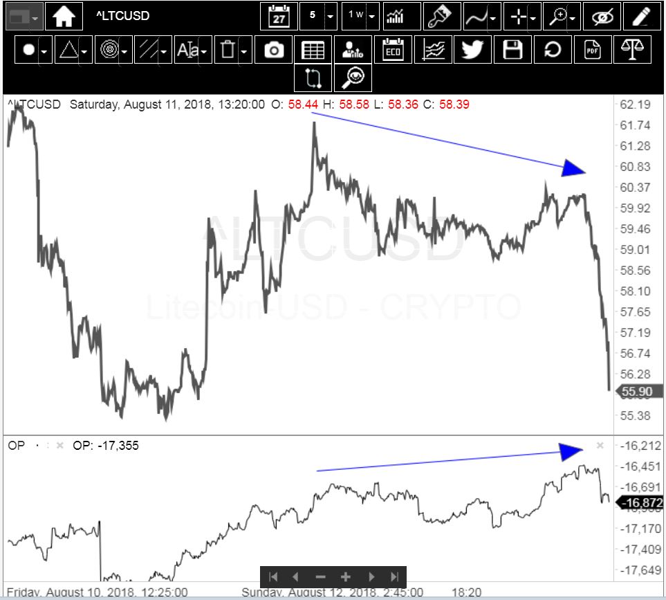
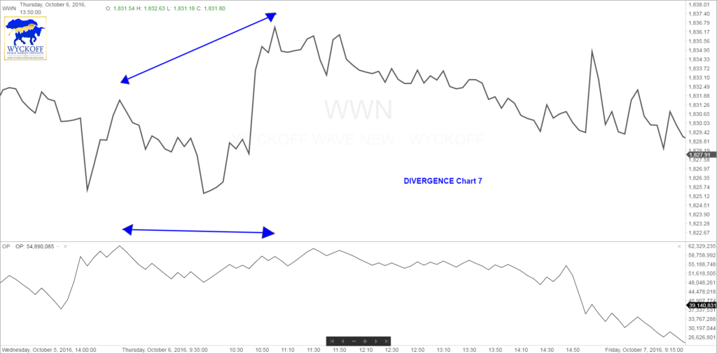
It also may be indicated by the Wyckoff Wave reaching a new high without the O-P Index reaching a new high on that move. This is illustrated on chart #7.
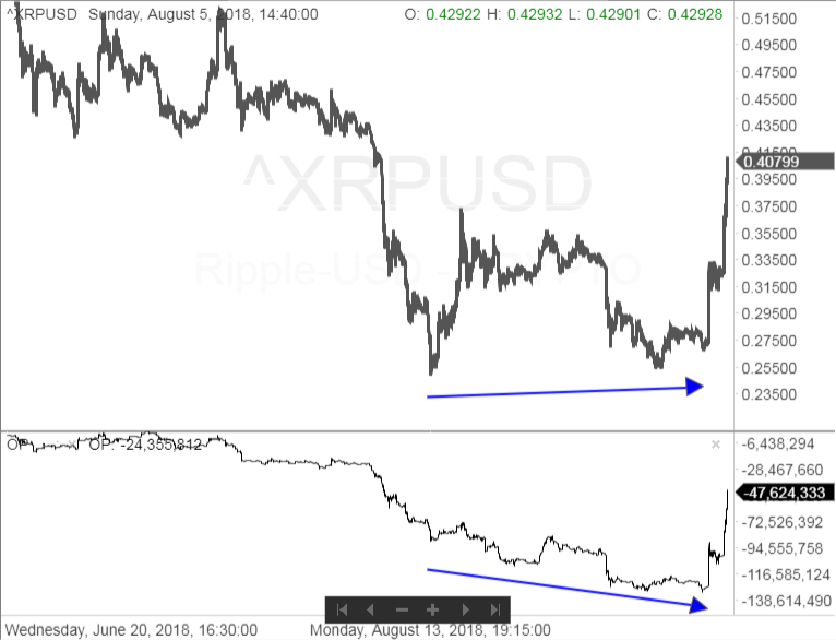
Now there is divergent action or divergence indicating the possible change in price trend from down to up. There are two ways this may be expressed. The first way is for the O-P Index and Litecoin to move downward with Litecoin failing to reach a new low, as the O-P records a new low for that move. In other words, the O-P goes into new low ground below a previous support area and the price of Litecoin fails to do that.
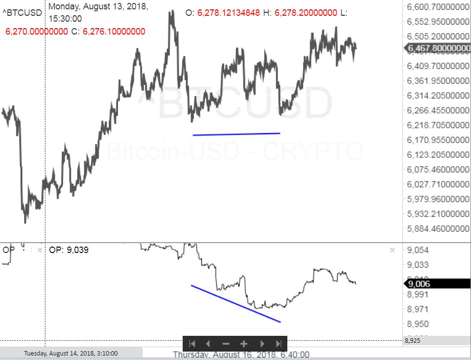
This is also shown in the following chart of Bitcoin. New lows in the OP while price holds.
The same phenomenon in Ripple, XRP. OP goes to consecutive new lows while price makes higher highs. Technometer was also at oversold levels as you can observe from second chart.
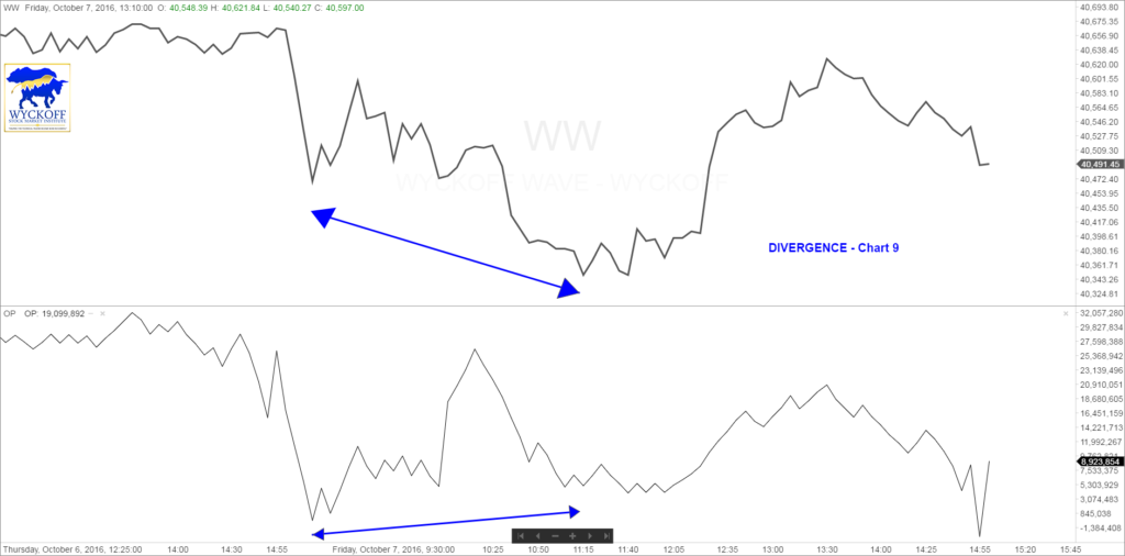
Another indication of a possible change in price trend from down to up, is the divergence occurring when the Wyckoff Wave moves into new low ground without pessimism being expressed for that move by the O-P Index going into new low ground also. In other words, the Wave goes below a previous support area, and the O-P does not. An illustration of this is in chart #9.
It is important to remember that both indexes do not always move into new low ground or new high ground on the same day. When one index records a new high you should give the other index time to complete its move. In a few days or a week or so the other index may also reach a new high and the indexes will be right back in harmony.
Now, the inharmonious action occurs when the two indexes are not in divergence. They are moving in the same direction, but they are not moving together. Essentially they are going at different speeds. This condition is determined mainly with a trend line, and the old levels of support or supply or stopping points for comparison. It is a warning that the move in the Wave may be in trouble. Chart #10 portrays inharmonious action.
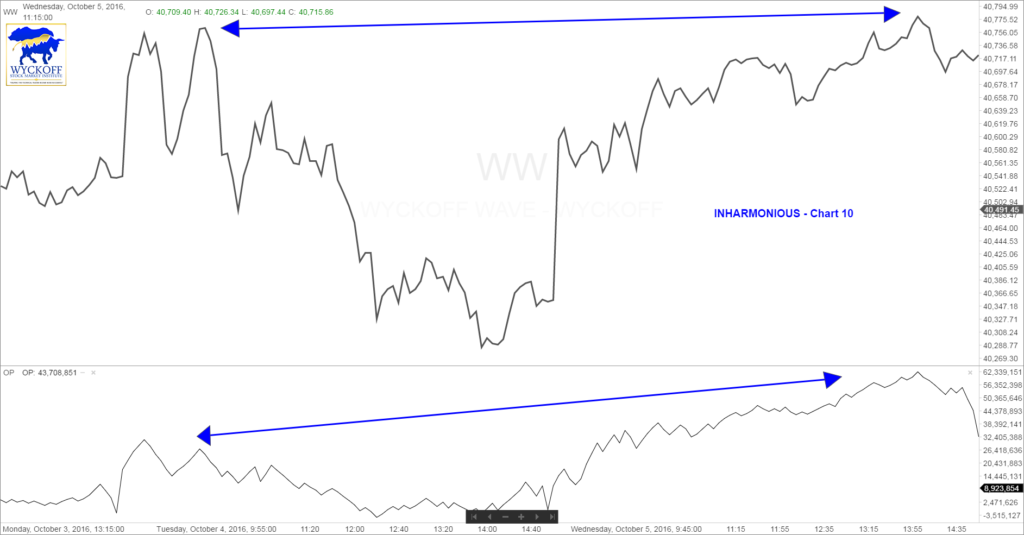
Where the O-P Index is moving much faster than the Wyckoff Wave. Both moved into new high ground, but the O-P moved faster and farther upward than the Wave. Chart #11 illustrates the Wyckoff Wave moving up much faster than the O-P.
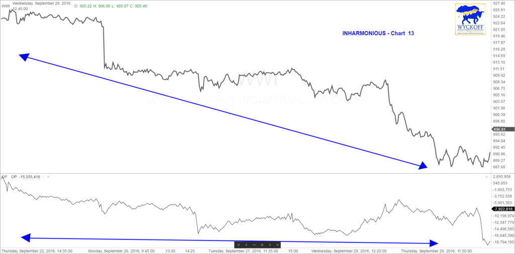
When either of these conditions occur you may continue to operate on the long side of the market as long as the Wave continues up. But, you must be alert for indications of a reversal or hesitation in the uptrend in the Wave. Charts #12 and #13 illustrates this inharmonious action on the down side.
The O-P Index is moving faster than the Wave in chart #12, reflecting strong pessimism being expressed.
In chart #13 the Wave is moving downward faster than the O-P. These inharmonious actions usually do not last long and are a warning to analyze the Wyckoff Wave and the individual stocks carefully for any reversals of trend.
Now, here are some reminders; first of all, before you come to any definitive conclusions as to whether or not you have inharmonious action or a divergence always give both the O-P Index and the Wyckoff Wave a few days to confirm each other. One may go into higher ground above an old supply point or stopping point before the other. And you may prematurely call a divergence. And then a few days later the other index will move up and come right back into harmony with it. You should also not over use the O-P Index as a mechanical tool. This is probably the biggest source of misunderstanding and misinterpretation of the O-P Index. Use the O-P Index as another means of measuring the forces operating within the market and the effect they are producing. And never fail to bring in other market principals to confirm or deny the indications of these two indexes. When the O-P and Wave indications appear, check these with other indications, such as the old support levels of the Wave and the trend lines. Look for selling and buying climaxes evidence of distribution and upthrusts, springs and the backing up to the edge of the creek. And other market principals which may be in operation.
There is a phenomena called the double divergence. This is a double indication of divergence or two divergences following each other in close succession. A double divergence usually means a much more important change of trend on the part of the Wave or of the O-P Index. As an example a double divergence may come about this way; first there is a new high by the O-P and a lower high by the Wave. And then a lower high by the O-P Index with a new high by the Wave. This is illustrated in chart #14.
This is often a start of an important move in the opposite direction. Again a double divergence warns a person to be alert. The O-P and the Wave are telling us that this is the time that a move is likely to start. After the O-P reverses itself and begins a very strong rally following double action and the Wave remains sluggish, this sharp up move is usually the start of the move. Chart #15 shows another intraday chart with numerous divergences marked. Please spend a few minutes and look at each one of these instances.
When negative optimism-pessimism is being expressed it would be an ideal time to take profit on any coins that you own that are going through a buying climax, and that have moved up into important objective areas. Also to sell those coins which you own, which have not responded to the advancing market. And you may put out short positions where they are indicated. But do not buck the trend of either the Wyckoff Wave or the coin in selling short.
In making comparisons of moves in the O-P Index, it is important that you deal with adjacent minor to intermediate moves only.
There may be a valid interpretation of the moves in the O-P Index which are a year or two apart. But we are not certain that our interpretation is correct. For example; on chart #4 reaction lows were reached by the Wyckoff Wave at point 7 and 2. The O-P Index at 2 is holding much higher than at 7, whereas the Wyckoff Wave was in new low ground below point 7. Do not make this kind of comparison. There is too much elapsed time and price action between these two points. You could make a comparison between points 2 and 8, as the move from 8 to 9, and from 9 to 10 are intermediate moves. You could also compare points 9 and 10. However, do not compare 9 with 11 in determining inharmonious action or divergence between the Wave and the O-P Index.
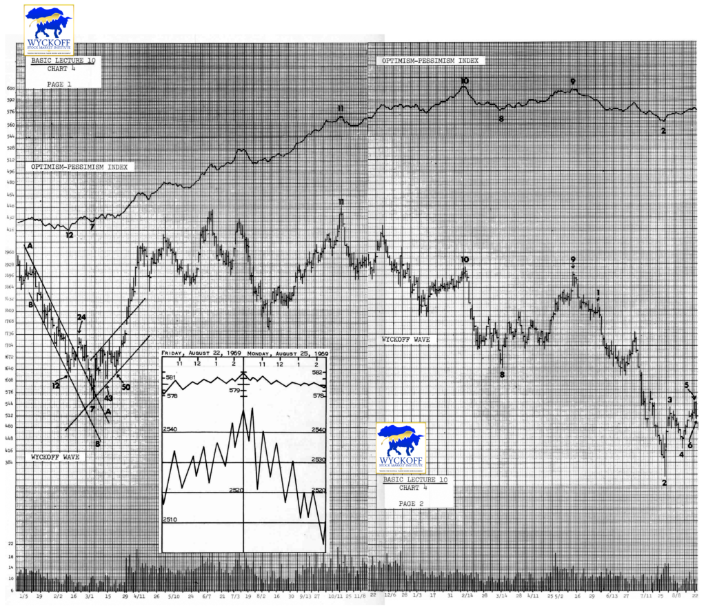
In October 1966 the O-P Index began a long upward move from 197 and eventually reached 612 in February 1969.
Again there might be a valid interpretation of the long term trend in the O-P Index. Such as this, particular trend. But we are not certain that our interpretation is correct. At this point in the development of our knowledge of the index we would suggest that you simply accept that a major trend exists. But in coordinating the O-P Index and the Wyckoff Wave that you use the shorter chart picture the miner and the intermediate moves only.
Unproven theories are dangerous in the market and generally cost money. Therefore, we do not teach them. Now let’s move on.
What is the process we have followed in this study? We have examined the prior background, the have used the intraday Wave and the O-P to determine what principles are in operation. Have related them to the daily vertical chart and to the figure charts of the Wyckoff Wave and O-P Index. And have then projected the probable direction, timing and the extent of the next move out of this base. The intraday breakdown figures have enabled us to analyze the daily vertical chart as if we are using a microscope.
Now let’s summarize a bit. The Wyckoff Wave and O-P Index are unique and very valuable market tools. The Wyckoff Wave is used as a trend chart and as a tape reading tool. This enables one to analyze minutely the critical turning points. However, indications that a move is continuing is as valuable as indications of changing direction. When the Wyckoff Wave is in the middle of a move or is not in a critical point in its travels from one level to another you may pay relative little attention to the intraday figures. Why? The trend is already established. However, when it gets into a critical situation, or is at a possible turning point, then you will find the intraday breakdown very valuable. We have introduced the Optimism-Pessimism Index to you. The O-P Index is derived directly from the intraday waves and is the trend of the volume of those waves. This means the O-P is also unique. It may be used with the Wave to diagnose divergences and inharmonious actions which are timing indications. At first your analysis of the individual waves may be painstakingly slow, and will be the result of a conscious effort in thought. As you become more familiar with it, your analysis will become unconscious, swift and almost instinctive. Even after your knowledge and experience are well developed you should make a careful analysis of the Wave and O-P at important actions and critical turning points. Then determine which are the important indications and which are relatively of minor importance, then act accordingly. You will discover that the Wyckoff Wave is your most important and valuable market tool. It has no equal as an analytical and timing tool. It is the starting point of ALL are market operations.